Wednesday, February 27, 2008

Activity #5: Write About It!! Theme


In Rembrandt van Rijn’s “Abraham’s Sacrifice,” an ink drawing on paper completed in 1655, and M.C. Escher’s “Reptiles,” a 1943 lithograph, the artists make use of themes.

In “Abraham’s Sacrifice,” Rembrandt’s themes are story and history. Artists use stories and histories because they provide the artist with subject matter (62). The subject matter is the objects or events that the work depicts (36). In Rembrandt’s drawing, he uses emphasis to portray the subject matter by creating a contrast in value with his hatching and cross hatching techniques. The title of the piece, “Abraham’s Sacrifice,” along with the subject suggests that this is a piece of history and illustrates a unique event in the life of Abraham. Escher, however, does not use history and story as themes in his work. He uses other themes.

In “Reptiles,” Escher’s themes are invention and fantasy. They come from the minds of the artists. In Escher’s piece, one can tell that the themes are invention and fantasy by the subject. Lizards crawling out of a drawing and the merging back into it can only be created through one’s imagination. It is clear that Escher conjured this work from a fantasy.

Both artists use themes to portray the subject matter within their pieces. Although the themes are different, each piece is unique and intriguing in its own light.

Tuesday, February 26, 2008

Wednesday, February 20, 2008

Activity #4: Write About It! Design Principles

PhotobucketPhotobucket

Both “Reptiles,” a lithograph by M.C. Escher in 1943, and “Abraham’s Sacrifice,” an ink drawing on paper completed in 1655 by Rembrandt van Rijn, use principles of design to generate fascinating works of art.

In “Reptiles” Escher uses the design principle of balance. Balance is the equal distribution of visual weight, the apparent heaviness of lightness of the forms arranged in a composition (125). In Escher’s drawing, the plant, the bottle, the open book, and the bucket serve as an implied shape that gives the composition balance. If one of these cornerstones is removed, notice the work becomes unstable. Not only does Escher use balance in his work, he also employs scale.

Both artists utilize the design principle of scale, although differently. Scale refers to size in relation to a standard or “normal” size (136). In Escher’s drawing, the lizards in the tessellation are the same size as those that crawl out. In contrast, Rembrandt uses hierarchical scale, the use of scale to indicate relative importance (138). Notice that the angel is drawn above Abraham, who is then above his son Isaac. This causes the viewer to assume that the angel is of a higher importance than Abraham or Isaac. Rembrandt also makes use of another design principle.

In “Abraham’s Sacrifice” Rembrandt employs the principle of emphasis. Emphasis means that our attention is drawn more certain parts of the composition than to others (134). He emphasizes the focal point, a small clearly defined area (134) in the piece by creating a contrast in value between Abraham, Issac and the Angel, and the foreground.

By using the design prnciples of balance, scale, and emphasis, both of the artists produce works that are appealing.

Tuesday, February 12, 2008

Activity #2: Write About It! Design Elements

PhotobucketPhotobucket

In 1655 Rembrandt van Rijn created “Abraham’s Sacrifice,” an ink drawing on paper. Later, M.C. Escher created a lithograph in 1943 called “Reptiles.” Both artists employ the visual elements of design, both similarly and differently, to create appealing masterpieces.

Both artists make use lines. A line is a path traced by a moving point (Getlein, 82). Escher uses implied lines, figures or objects spaced closely enough that our minds connect them (86), to exhibit motion. A figure is the shape we detach and focus on (89). The lizards themselves act as a “dotted line” that creates a circle as they morph from imagination to reality and back again. In contrast, Rembrandt utilizes implied lines to portray direction of light entering the picture and contour lines can be seen in the outline the figures of Abraham, his son Isaac and the angel. Contour lines are the boundaries we perceive of three-dimensional forms (83).

Also portrayed in both works is the design element of light; though used for the same reason, different techniques are utilized. Escher uses a technique called chiaroscuro. It is a technique that employs shades of lights and darks, known as value (92), to record contrasts of light and shadow in the natural world (92). Escher uses this to create shadow and light direction in his work. However, Rembrandt uses hatching and cross hatching to portray the same effect. Hatching is the use of closely spaced parallel lines (93) and cross-hatching is a technique that uses additional lines laid on top of the first set to achieve darker values (93). Through these techniques, Rembrandt is also able to produce shadow, apparant beneath the angel's wing, and light direction.

The design elements of shape and pattern are present in Escher’s work. Shape is defined as a two-dimensional form that occupies and area with identifiable boundaries (87). In “Reptiles” Escher makes use of implied shape. Notice the shape that the lizards seem to create as the travel in and out of the pattern is that of a circle. Pattern is any decorative, repetitive motif or design (105). The tessellation that the lizards seem to crawl out of is an example of pattern.

Both artists employ the design elements of line and light in their masterpieces. Escher also uses pattern and shape. Although both works used the same elements, they produced completely different works that are both visually intriguing and interesting.


Note: All sources are from the Living With Art textbook.

Sunday, February 10, 2008

Activity #1: On Line Museum Visit

Photobucket
M.C. Escher, Reptiles, 1943 Rosenwald Collection

Photobucket
Rembrandt van Rijn, Abraham's Sacrifice, 1655 Rosenwald Collection

Wednesday, February 6, 2008

Creative Post


This photographer used his latest digital effects along with influence from M.C. Escher, my new favorite artist. Very interesting. Fits right into the Surrealists style.

This drawing from Escher teased my brain. One hand drawing another? Just another great work from the surrealism movement.

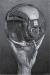
I really like this work, again by Escher. It amazes me that he had the ability to replicate reflections that seem extremely real. It almost feels like I was looking into the sphere. Except that I don't look like that and my room doesn't resemble the one in the reflection. Still it is a thinker!

Just thought that this was interesting. Primary colors really stand out in contrast to each other.

Given that we just created our own collages, I thought that I would add images of hobbies of mine in the form of collages.
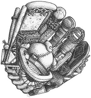
I like playing baseball. What I like about this collage is that it uses things that you would find in a ballpark as a theme. The peanuts used as leather threads was a good idea. I also like how the artist showed the fingers gripping the baseball.

Basketball!! My favorite sport of all. Speed, agility, quick thinking and reacting and pure athleticism. I just see a lot of random things in this collage. Nothing that really has to do with basketball. Perhaps the artist used these objects symbolically. I just like the sport.

Fishing is amazingly relaxing. There's nothing like the sound of running water and birds chirping and the feel of a fish striking your line. Again, the artist uses fishing objects as a theme. Different types of lures and baits are present along with nets and even a vest.

Like fishing, hunting is equally relaxing and has a great excitement associated with it. Quiet mornings and nature's sounds then, a loud boom and the adrenaline is pumping. Same theme, hunting objects. Shotgun, shells, animals, knives and a bow.

Football is a sport that I enjoy but don't get to play often. I do watch my Cowboys every Sunday during football season though. Same theme here. You see the helmet, the football chin strap, the goal post face mask and the shoulder pad logo.


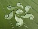
I'm not sure that I believe that crop circles are made by UFO's or some really talented artist who likes working outside with crops instead of a canvas. But, artistically speaking, they have great balance and have clearly defined shapes and lines. Very intriguing.

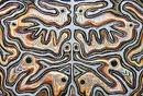
Sometimes nature makes some pretty remarkable pieces of artwork. Looks like a human face to me. Or maybe the face of a lion or baboon! What do you see?

I thought that this was interesting. I noticed the shapes of the human body; legs, head, chest, and facial features. Then as I looked more I also saw that it could be seen as hills with trees and waterfalls. Really quite unique.

On our visit to the Art Gallery my wife and I were looking for one of her paintings and we came upon this one. Its a work by Sir Peter Paul Rubens. The theme of history and story was obvious after reading out text. It's a story that I was told many times when I was young. It is interesting to see it from this light.

What do you see when you look at this? Most see the word MIRROR. It is definitely there. What is so great about it? It is also a reflection of itself, perfect symmetrical balance. Draw a line down the middle of the dot in the middle and it is a perfect reflection.

I really thought that this was interesting. It is a work by M.C. Escher. If you look at it, it seems that the picture displays two different scenes. If you look from the top towards the bottom, it looks as if the stairs are going down. If you look from the bottom up, the stairs seem to be going upwards and be underneath an archway. It is neat to see the way he uses value and chiaroscuro to create this double image.

Chapter 5 discusses two main types of balance: symmetrical and asymmetrical. Symmetrical balance has an implied center of gravity that is the vertical axis where forms on either side of the axis correspond to one another in size, shape, and placement (125). Asymmetrical balance is similar though both sides don't match. The piece on the left is an example of symmetrical balance. Notice the image seems like an exact reflection across an imaginary axis. The piece on the right is an example of asymmetrical balance. Like the first, it seems like a reflection; however, the two sides are not matches. One has a larger tree and a larger mountain.

I like the atmospheric perspective used in these types of paintings. That's where the landscape seems to become hazy as it goes off into the distance. "Pictures are worth a thousand words" as the phrase goes. This painting sums up who I am. I enjoy everything outdoors. If I had to pick one word to describe how what I feel when I look at this... it would be envy.

ART 101 Introduction

Hello to all!!
My name is Joshua Young, call me Josh, and I am in my second year and I am an engineering major at the moment. That could change sometime soon. I'm juggling between that and forensic science. I hope to transfer to a 4-year institution someday. Like many, I am taking this class to fulfill a humanities credit. But I must say, after reading the syllabus and course outline and skimming through the book, the class looks to be very interesting. The last and first time I have ever been to an art museum was in December of 2006 in the National Gallery of Art when my wife and I first moved here. We are actually taking this course together. I can't really remember what piece I liked the most because it was so long ago, but I like paintings of scenery. My favorite visual artist is Thomas Kincade. I hope that everyone has a great semester.